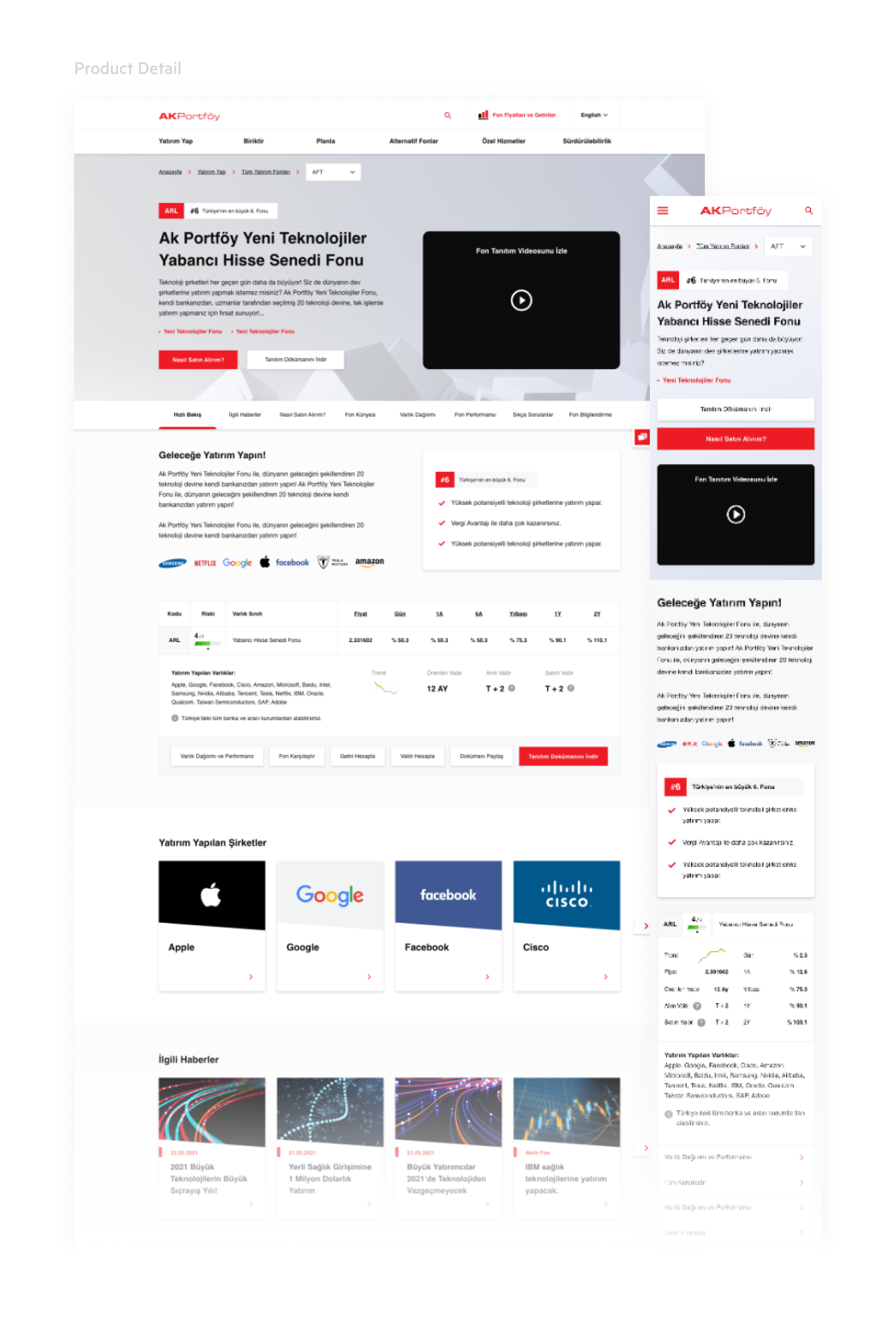
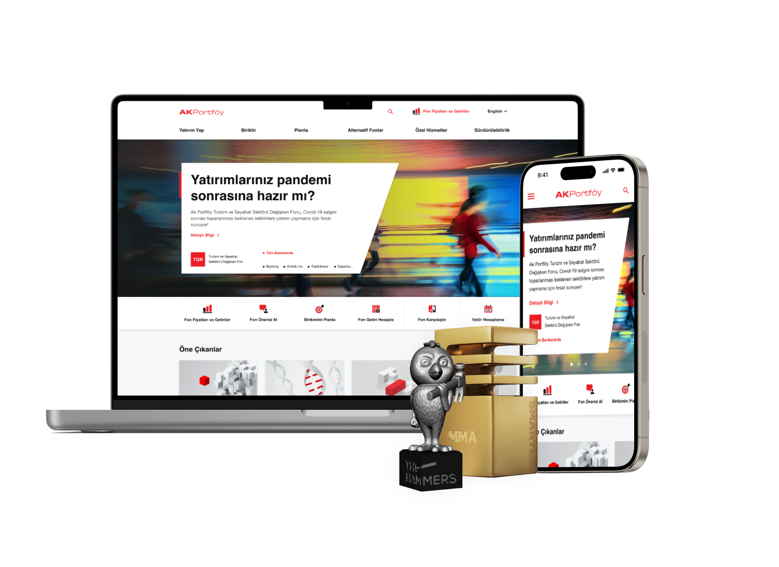
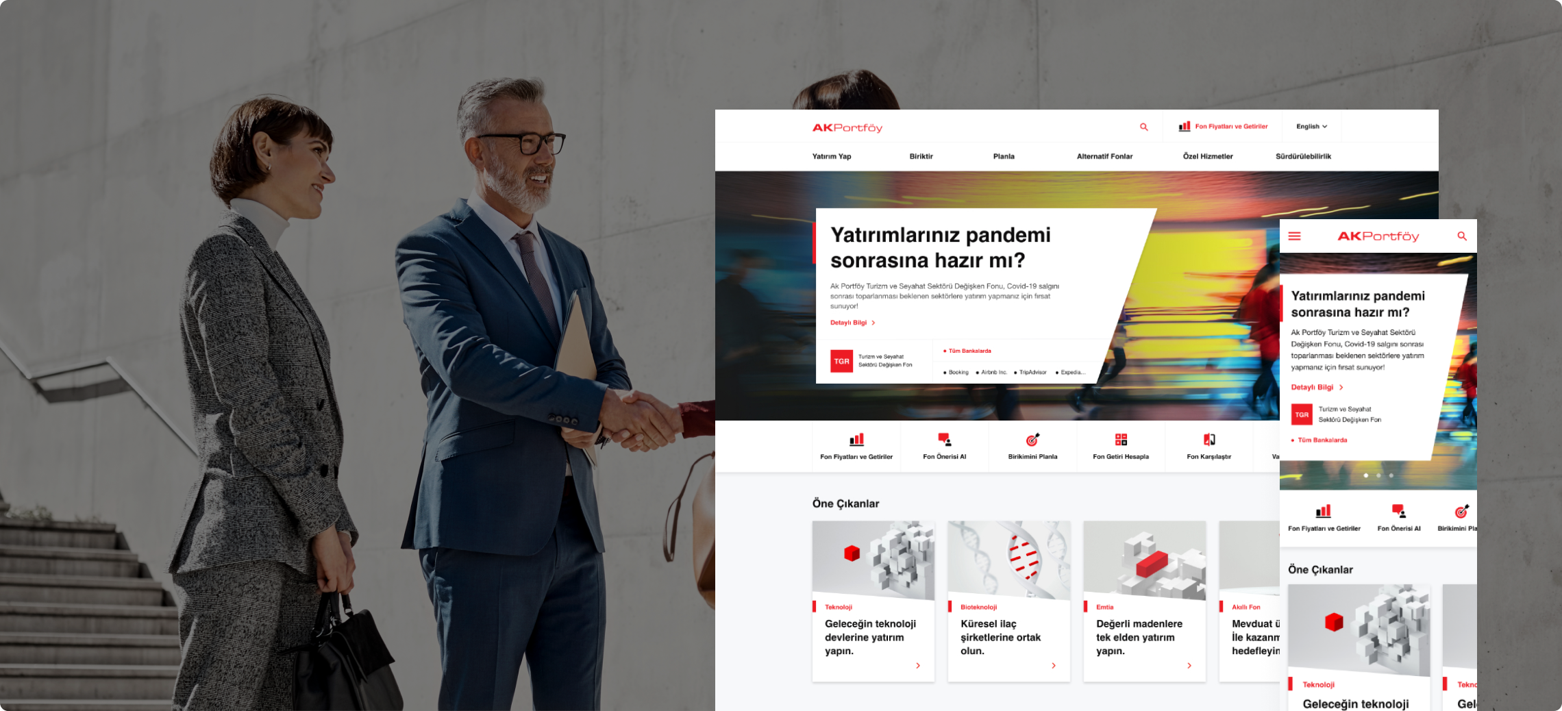
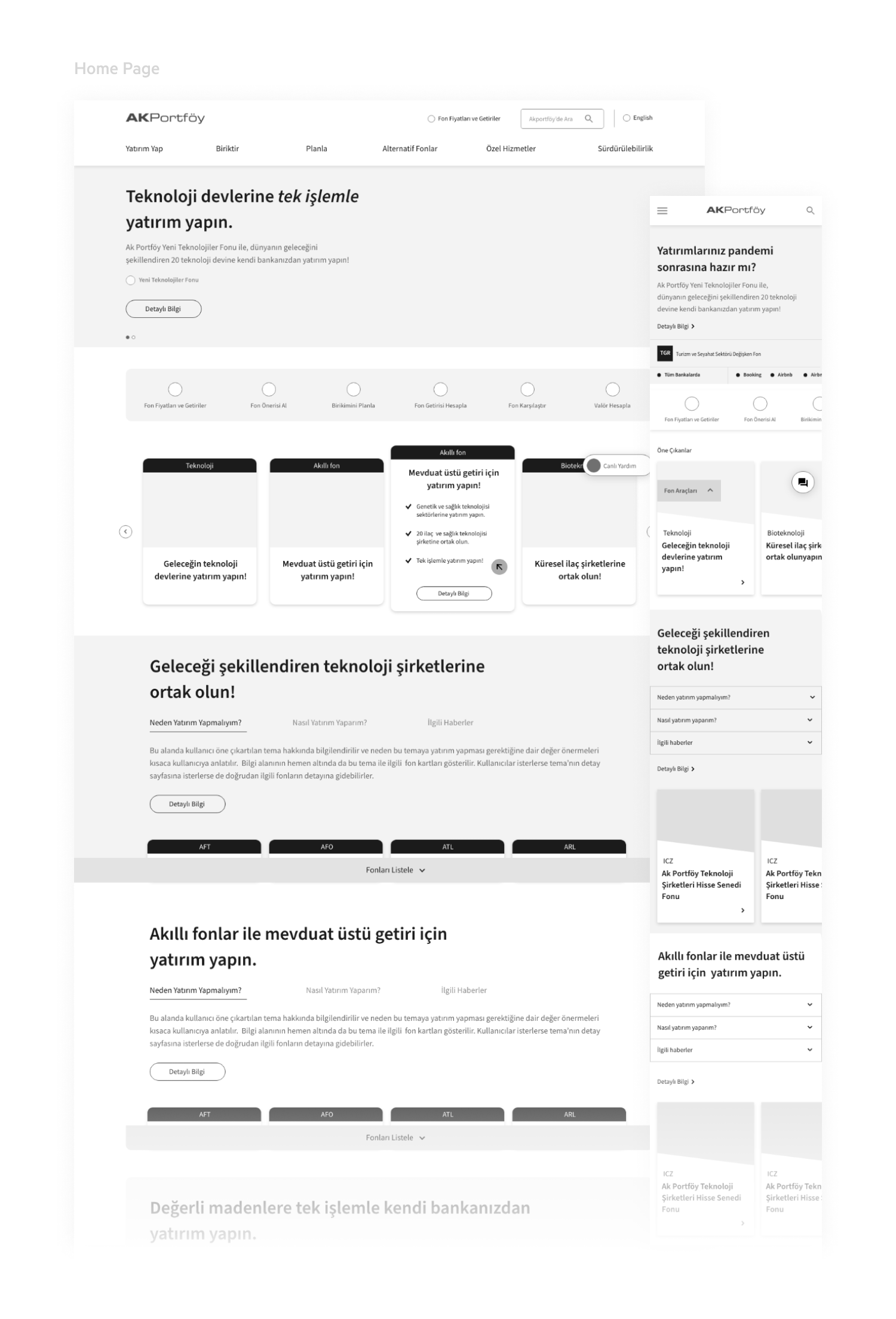
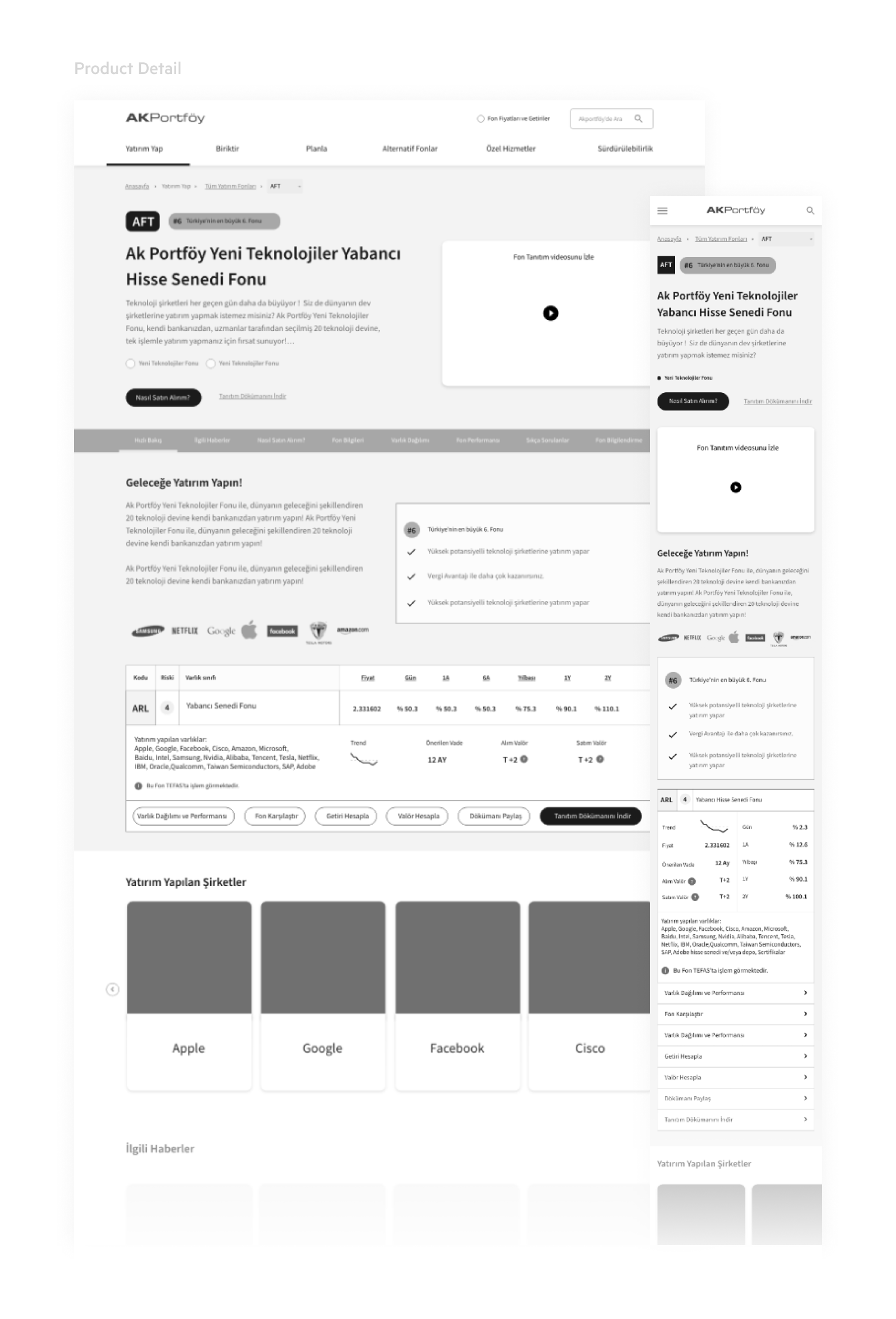
The first point we focused on was the customer experience. Providing quick solutions to customer needs and ensuring user convenience in their transactions were our primary goals. With its simple, understandable, and easy design, AkPortföy's website now offers a richer and higher quality digital portfolio management experience. We created a responsive website that promotes customer loyalty on both desktop and mobile devices. The new design offers comprehensive investment options, simplifies the application process, and features a help module for easy navigation. Key functionalities include detailed information on mutual funds, pension funds, and tailored investment solutions, catering to both novice and experienced investors.
User Experience Design
We designed the user experience of the AkPortföy website interface using responsive technology to accommodate the screen definitions most frequently used by our customers. Features highlighted on the website are categorized and positioned within the site navigation. This structure provides users with a guided experience, helping them understand what actions can be performed. This design ensures a seamless and efficient interaction, whether accessing the site from a desktop, tablet, or mobile device, enhancing the overall digital portfolio management experience.

User Interface Design
Our primary goal for the AkPortföy website was to create a clear, engaging platform that enhances user experience. We designed a modern interface prioritizing simplicity and functionality, with an organized layout and a brand-aligned color scheme for intuitive navigation and visual appeal.
Key features like portfolio management, investment options, and application processes are easily accessible, ensuring users can quickly find and use essential tools and information. The streamlined design and practical usability offer an effective and efficient experience, helping users manage investments and make informed decisions with ease.


